A first-try 15–20% conversion lift — with no ASO background

A few weeks ago, a developer named Mattia messaged me. He’d started poking at his Google Play listing with Apptonomy and wanted to share some feedback. One of the first things he told me was disarmingly honest: the setup guide was “super clear even for someone like me who has no idea about many of these terms.”
That line stuck with me, because it describes most of the people who make apps. Not ASO specialists. Not growth teams with a keyword tool open in another tab. Just developers who shipped something they’re proud of and sense, somewhere in the back of their mind, that the store listing could be doing more — without knowing what to change.
This is what happened next: how Mattia went from “I have no idea what’s wrong” to a rebuilt listing and a live A/B test that his new screenshots won — on his first try, in about three weeks, with no ASO background at all.
“I’ve hated these screenshots for a long time”
Mattia runs Simple Gameplay, a small studio in Barcelona. Like a lot of indie teams, they ship a game and move on — there’s rarely time to circle back and optimize a store page. His puzzle game, Block Stars, had a listing he’d quietly disliked for a long time. But disliking your own screenshots and knowing what to do about them are two very different things.
He had no ASO training. He’d never run a store-listing experiment — he didn’t know Google Play even offered one. So the listing just sat there, the same way most listings do: not because the developer doesn’t care, but because the gap between “something feels off” and “here’s the specific fix” is exactly the gap most people can’t cross alone.
What the audit actually told him
Mattia ran his game through Apptonomy’s audit. The report did the one thing he couldn’t do for himself — it told him, specifically, where the listing was losing people. His screenshots were the weakest part, and not as a vague score, but as a list of concrete, plain-language fixes. One of them flagged that a promotional overlay on a screenshot was advertising something the title and description never backed up, so it read as noise instead of a reason to install.
For the first time, he wasn’t staring at a listing he vaguely disliked. He had an ordered list of what to change and the reasoning behind each item. That’s the whole point of an audit — not to grade you, but to hand you the next move.
The rebuild
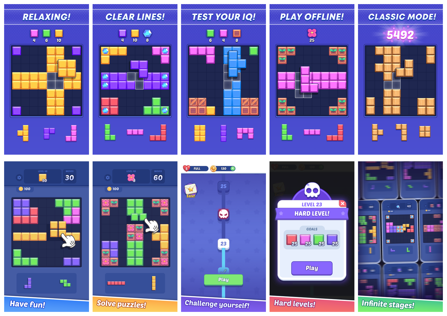
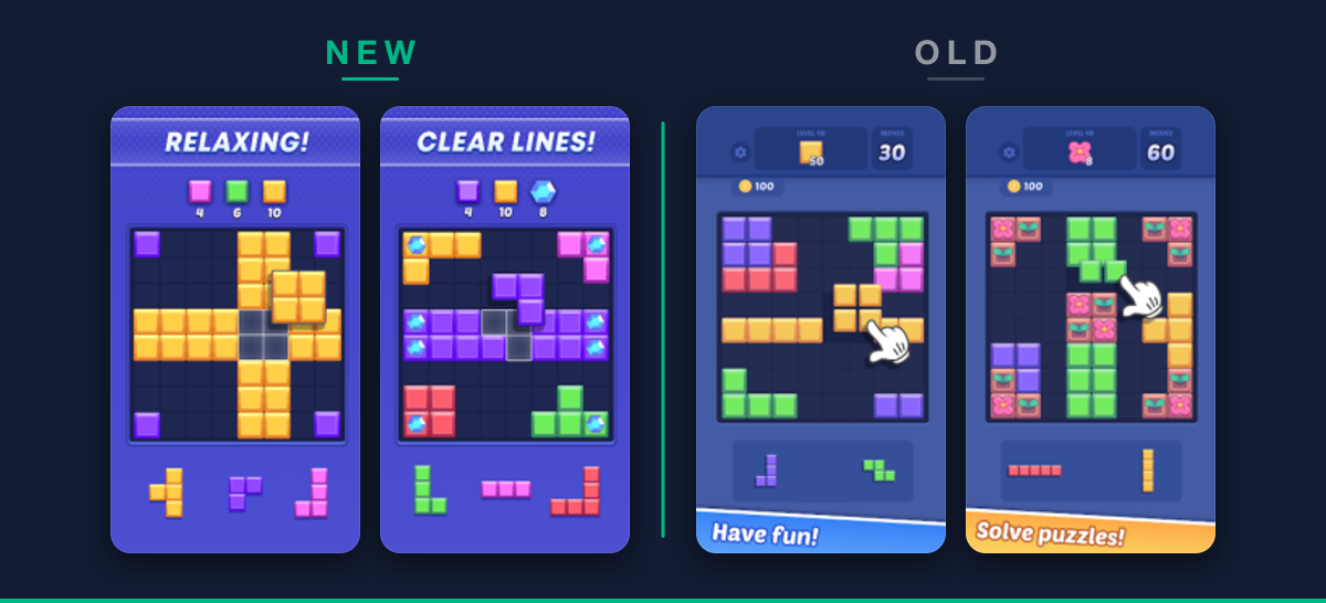
Mattia rebuilt the entire set — every screenshot, plus the short and long descriptions. He gave it a consistent look, led with what actually makes the game appealing, and added a frame for the mode they’d just launched. When he sent me the drafts, I had two small notes: make the text and elements bigger so they survive on a phone screen, and put the most distinctive mechanic up front. He turned them around the same day.
The difference is hard to miss. The old set was dark and busy; the new one is bright, benefit-led, and tells a clear story from the first frame.
He tested it instead of guessing
Here’s the part I want other developers to notice. Mattia didn’t just swap the screenshots and hope. The audit had pointed him to Google Play’s Store Listing Experiments — the built-in A/B testing that runs a new listing against the old one on live traffic and shows you which converts better.
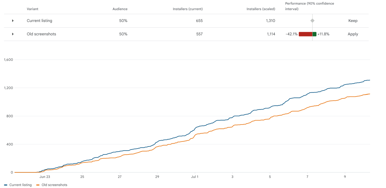
He’d never heard of it. In his words: “I had no idea Store Listing Experiments exist — we rarely iterate, so we usually can’t spend time on A/B testing our Play Store page.” That’s true for most small teams. A/B testing sounds like something only big studios with analysts do. It isn’t — it’s a free feature sitting in a console most developers never open. So instead of guessing, he split his traffic 50/50, new set against old, and let the data decide.
The result, on the first try
The new listing pulled ahead and stayed ahead. Across the experiment it converted visitors into installs roughly 15–20% better than the old one. It’s an early read — a live experiment over a few weeks, not a closed statistical verdict — but the direction was clear from the start, and it was his first attempt. No rounds of trial and error. No ASO background. A developer who, three weeks earlier, didn’t know this kind of test existed had run one and won it.
Why this is the story I wanted to tell
It would be easy to frame this as “look what our tool did.” That’s not the interesting part. The interesting part is Mattia. He was always capable of making better screenshots — he proved it in an afternoon. What he was missing wasn’t skill or effort. It was knowing what to fix, in what order, and how to prove it worked.
That’s the gap Apptonomy is built to close. Not to do ASO for you, but to hand a non-expert the same starting point an expert would have: a clear diagnosis, a prioritized fix, and the right way to test it. Close that gap, and the work that usually takes months — or never happens at all — takes a few weeks and produces a real result on the first try.
Mattia put it best at the end of one of his messages: at the very least, it was the motivation to finally change the screenshots he’d been hating for so long. He got a lot more than motivation. But that’s where every good ASO story starts — with someone who finally knows what to do.
Curious what your own listing looks like through the same lens? Paste your app’s store URL into Apptonomy and see where you’re leaving installs on the table — in about the time it took to read this.